
POWERSCADA
Browser Editor
The PowerScada editor is a web page. Engineers do not install anything on each computer: open the browser, log in, draw the monitoring screens by drag and drop, then click Deploy to update the runtime on site.
Saving and deploying are two separate things. Ctrl+S only stores the design in the project and never touches the screens that are running; once you are satisfied, click Deploy. The site never has to stop just to change one button.
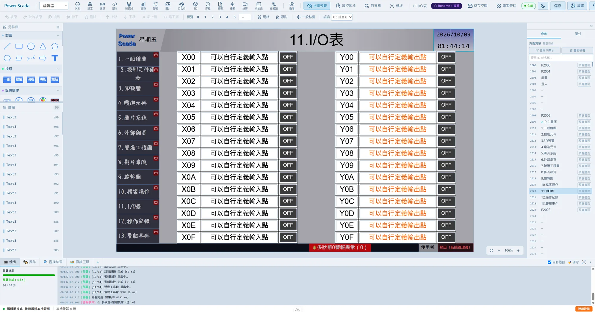
Canvas and component handling
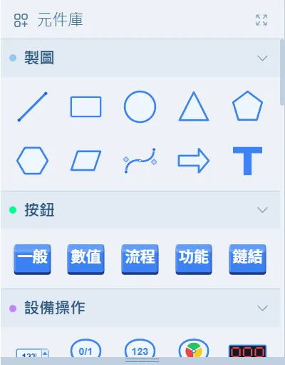
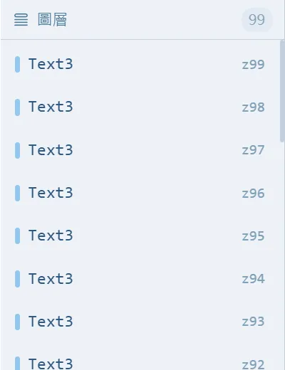
The editor has five areas: the top bar (save, deploy), the toolbar (align, layers), the component library and layer list on the left, the properties panel on the right, and the output, operation log, search and watch panels at the bottom. The canvas supports left-drag, marquee selection, middle-button panning, wheel zoom and a right-click menu.
- A full set of shortcuts: Ctrl+S to save, Ctrl+Z/Ctrl+Y to undo and redo, Ctrl+A to select all, Space to rotate 90 degrees, arrow keys to nudge (1 px, or 10 px with Shift), and Ctrl+F to search components and text across every page.
- Align and distribute: horizontal and vertical alignment, center on canvas, equal spacing, flip; grid display and snapping with an adjustable spacing of 4 to 200 px.
- Multi-select property editing: change every property of components of the same type in one pass; ten component types, including numeric displays, gauges and indicator lights, can also have their data source assigned in bulk.
- Component groups: Ctrl+G binds components that usually move together into a group; double-click to edit it in isolation. Groups do not affect layer order or the runtime.
- Bulk duplicate: set the horizontal and vertical counts, the gap and the fill order; when bound to an array variable the index increments automatically, so a row of identical equipment is laid out in seconds.
Pages and layers
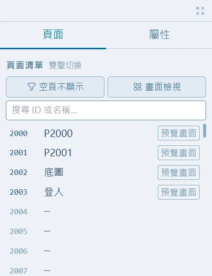
New pages default to 1920×1080; double-click to rename and drag to reorder. Each page can reference up to three layer pages (bottom, middle, top): build shared title bars, navigation bars and backgrounds as layer pages and every page updates together.
- When page numbers are moved or swapped, every page-jump button, popup, background, alarm navigation target and main-page setting follows automatically.
- View preview, touch-area display, fit-to-window, and dark and light themes.
- Page screenshots can be exported page by page as PNG and bundled into a zip, handy for acceptance documents.
Images and paste-to-use
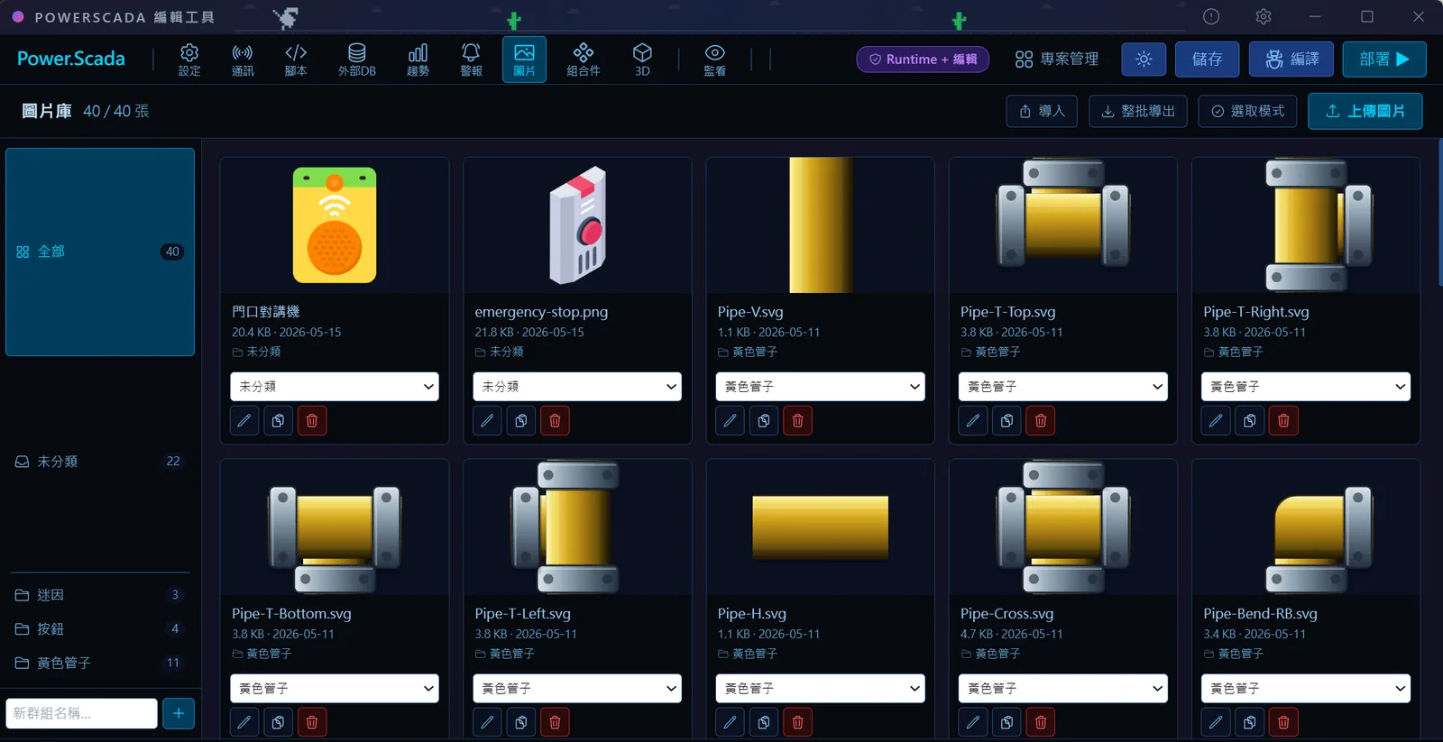
More than a hundred industrial vector graphics (fans, pumps, valves, fittings, sensors and more) are built in. Browse them by category in the image picker or search by Chinese or English name; there are no image files to carry around with the project.
- Ctrl+V pastes PNG, JPG or SVG images straight onto the canvas and uploads them to the project image library automatically.
- Copy cells from Excel or Google Sheets and paste them to get a table component (up to 50 rows × 20 columns).
- Components can be copied and pasted across browser windows and across projects; the images they use are carried over automatically.
Deployment and editing while running
After you click Deploy, the bottom panel shows the progress of fourteen steps, including database switching, stopping old scripts, PLC communication, camera streams, the script engine, background tasks, trend logging and alarm monitoring, until deployment completes.
Edit-while-running mode lets an engineer connect to the field devices from their own computer: the screen shows real live values and communication status while the design is stored locally. "Deploy to device" compares the two sides section by section; only a sync that includes communication or project settings restarts the device, while other sections just reload the matching subsystem and communication is not interrupted. Sections such as the multi-language dictionary, background tasks and alarm rules take effect as soon as they are saved while running, with no redeployment.
Screenshots
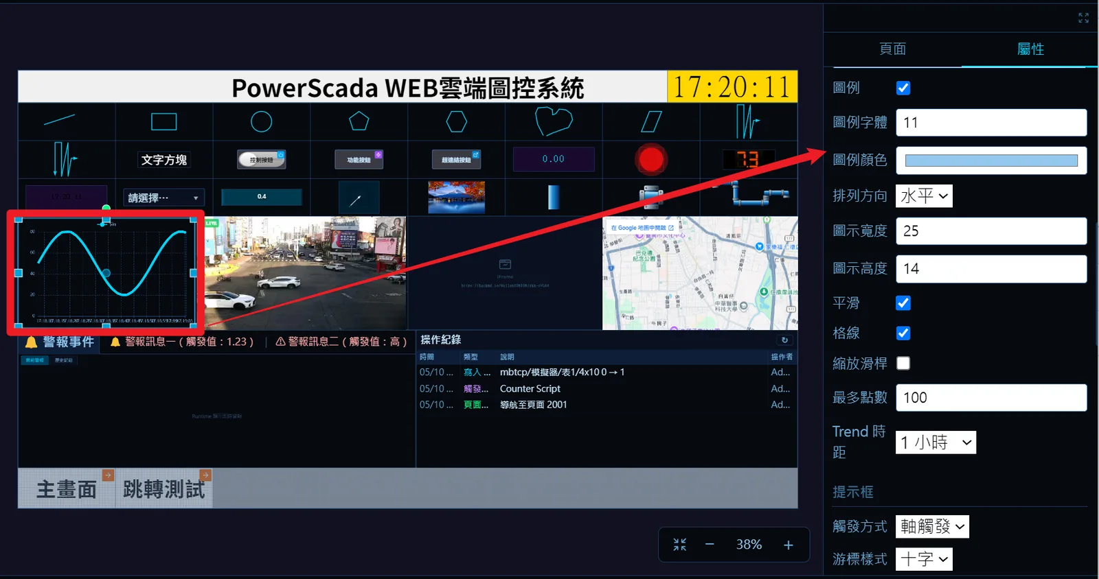
How to set it up
- 1Log in with an Engineer account or higher and open the project from the Project Center to enter the editor.
- 2Add a page on the left; if needed, set the background and the bottom, middle and top layer pages in the canvas properties.
- 3Drag components from the library onto the canvas, bind tags and set the appearance in the properties panel on the right, and swap images from the built-in library or by uploading your own.
- 4Multi-select components of the same type to edit properties in bulk, tidy the layout with align, distribute and grid, and press Ctrl+G to group components that move together.
- 5Press Ctrl+S to save, then check the layout with view preview, touch-area display and the language drop-down.
- 6Click Deploy and wait for the fourteen steps to finish, or click "Deploy to device" in edit-while-running mode for a partial sync.
FAQ
FAQ
Will changing a screen interrupt the monitoring that is running?
No. Ctrl+S only saves the file; the runtime is not updated until you click Deploy. If a deployment includes communication changes, the service restarts for a few seconds; if you only change sections such as the multi-language dictionary or background tasks, saving while running takes effect immediately.
Why can't I resize a component to a very small size?
First check whether snapping is on. With snapping on, every resize aligns to the grid spacing (20 px by default); turn snapping off or reduce the spacing. The minimum size by drag-resizing is 4 px; for anything smaller, type the width and height directly in the properties panel.
What is the difference between a group and a composite component?
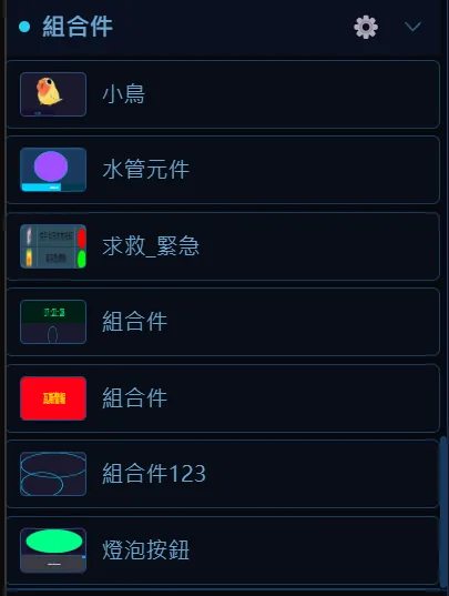
A composite component is a reusable template: change its definition and every instance updates. A group just bundles a few components on the current page so they move together; the members stay independent and can be bound to tags individually, and copies made from a group are not linked to the original.